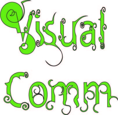
Doing this typography was fun. It really was educational as i learnt how to create the fonts on my own so it doesnt look like a standard font that microsoft word always gives. I especially love the swirls (top right) picture. It really captivated me and i couldn't stop myself from doing more and more and turns out it looked pretty good to me! I will definitely use this in the future !
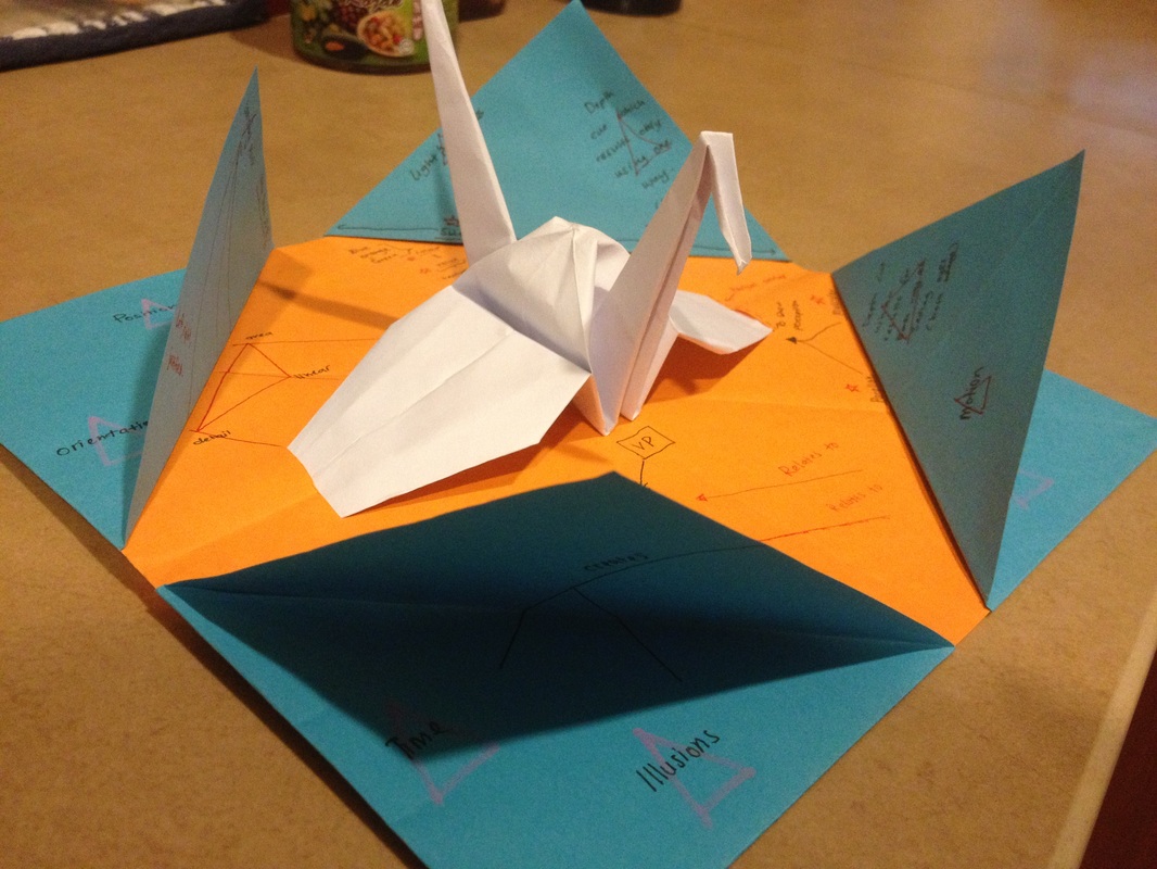
This little origami was something useful that Miss Ivy has taught us. Its one of the many easy ways of 'studying' or 'remembering' something. This is like a dimensional plane, each flaps representing a topic and inside the flap contains the information about the topic. The reason why it is multi-coloured is also because of a psychological factor. The vibrant colours helps a person to remember easily. For example; the orange has the resonings and the blue are the topics of the reasonings. This way, we wont get confused which one is for which. Each side holds a topic so its easy to remember ; upper left, bottom right, etc. Truly i intend to use this fun method to study as folding origami too helps release stress.
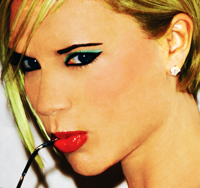
This week is our Quiz for this subject. We are asked to take this picture of Victoria Beckham (left) to remake her face to make her look much more appealing. Doing this i had quite a trouble making her skin smooth because of the many blemishes she possesses and the lighting on her skin has cause tones of the colour to be off-key. In the end, adding a little bit of eye-liner, lipstick, foundation and changing her hair colour, its a whole new Victoria Beckham. All within the usage of Adobe Photoshop.
Artwork 3
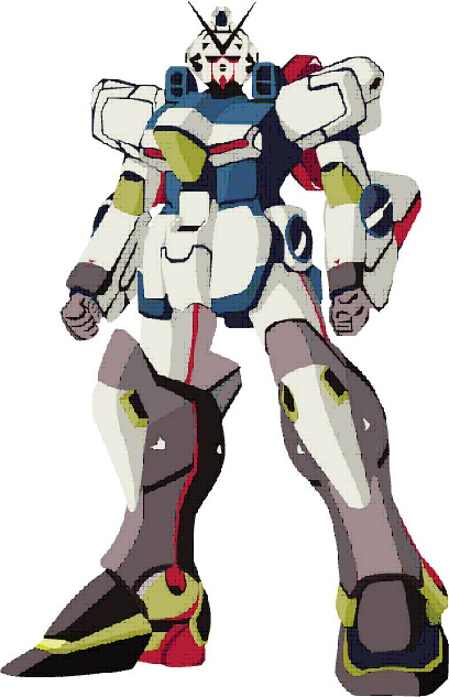
We were given this image of a gundam model as our artwork 3 assignment. We are to use Adobe Illustrator to redesign and change the designs of the original picture to something of our own. Doing this has really taught me patience and has given me a broader perspective on Adobe Illustrator. Truly now i can understand how replicas of different colours of the same image comes about and that it is easily duplicated. Truly it was an educational topic to learn and it will probably help in future usages.
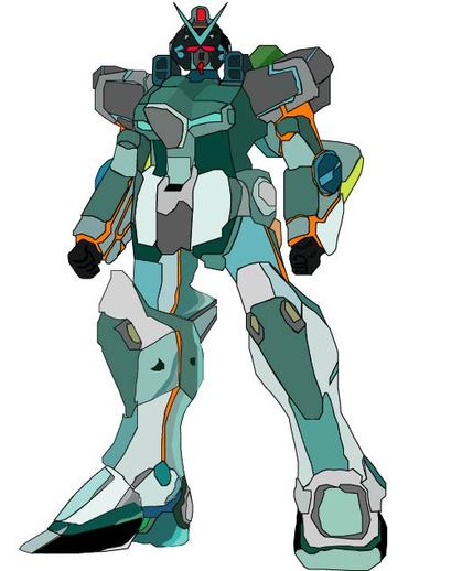
This is the after image, adding colours as i see fit to my own eyes.
Hmmmm, week 5.
Well, thhis week's assignment is to analyze a page that consists of different fonts and pictures. The fonts are not really visible and it is difficult to read what it says. Fonts that are too small especially when printed will be difficult for the public's eyes as it is very straining. When something is difficult to read and understand, a human's natural behavior is to ignore and to not bother about the message that is trying to be shown. Pictures are also another major asset when trying to explain or promote something. The picture should be bright, clear and visible. Not blurred and shaky and the object not being visible. The picture is especially important as the picture helps to explain the situation better than words. Like they say, a picture is worth a thousand words.
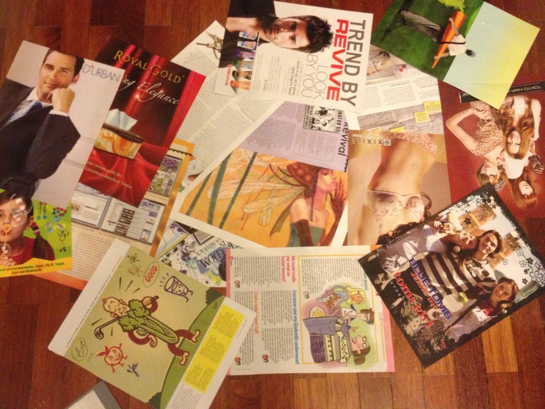
we are expected to collect 3 pieces of each item of:
1. Vector Illustration
2. Hand Painting
3. Caricature
4. Technical Drawing
5. Good Poster Design
6. Bad Poster Design
Throughout this experience, I have greatly discovered the beauty in magazines. I don't mean looks of models and such but the details on how the page was made, the littlest designs that makes the poster more attractive to the eye or also may be the downfall for the magazine.
It was pretty tough to find the caricature because, not many people do that anymore. Its a dying art. Maybe its visible sometimes on newspapers but nonetheless, its rare.
Visual Communication is a subject that is really different than the other subjects you learn about. It doesn't exactly follow according to the title of the subject. It really is something which many students would love to learn and also some adults need to know about. It has suprised me in many ways and testing my knowledge of imagination and creativity. I really like this class alot. So far, i've been taught that each individual view things in a different perspective. I've learnt about how to edit pictures and use photoshop, I do somewhat have some knowledge of using photoshop but visual communication has broaden my view and taught me a few new tricks to use.


 RSS Feed